NoPlateau
NoPlateau is a platform designed to help users find the skill building resources they need, faster.
Summary: Inspired by my own process in finding a quality path to a new career, the goal was to create a platform that truly simplifies a user’s search for quality online education resources.
Duration: 4 months Role: UX/UI Design student Tools: Figma, Pitch
Work: I worked closely with a DesignLab mentor to help bring this project to life from beginning to end. I conducted user interviews, synthesized the data collected during the interviews, and led the UI design of the site while utilizing the expertise of my mentor to guide me through decisions that would be most beneficial for users.
Problem
Knowing where to start when learning a new skill or hobby can be a daunting task. The Internet is a wealth of information but determining what is, or isn’t, a quality resource can be challenging. From YouTube to Skillshare to local classes to books. The vast amount of options can leave people discouraged, unable to follow through, or even quit before they get started.
27 Million Users
59 Million Users
12Million Users
118 Million Users
The growth of online learning has boomed with new platforms popping up all of the time. While having more options can be great for users, it can also make deciding what platform is best for them exponentially more challenging.
Solution
A platform dedicated to providing a simplified way to find and compare what skill building resources are available and what they offer. Streamlining the search for resources could increase how likely a user is to follow through on learning that new skill or hobby by allowing the focus to be on learning rather than searching.
$350B
The overall global eLearning market is expected to hit $350 billion by 2025.
438%
The number of registered learners on Coursera has increased 438% in 5 years.
70%
70% of students agree that online classes are better than traditional classroom settings.
There is nothing else on the market that caters to a user's ability to efficiently make more informed decisions regarding what resources they have at their disposal and which of those resources best suit their needs and learning style.
Competitive Advantage
Research
To be certain a problem that was needed to be solved was being addressed, the process began with research.
User interviews were conducted with five participants utilizing a research goal, research objectives, and scripted questions.
Once the interviews concluded the data was synthesized, an affinity map was created, and ultimately user personas.
Research Goal
We want to know what resources/methods people currently utilize to learn a new skill/ hobby so that we can create a centralized hub for users to access reliable resources across varying mediums that suit their preferred learning style.
Research Objectives
Understand motivation for learning a new skill/hobby.
Understand users preferred methods for learning.
Learn what issues users face when starting research on desired skill/hobby.
Determine what success looks like for users wanting learn new skill/hobby.
Research Questions
What resources do users currently utilize?
What challenges do users experience when searching for resources?
What would improve the user’s ability/motivation to continue learning?
What issues do users face that leads to not pursuing original goal?
Key Takeaways
The data obtained indicates that users consistently utilize a wide array of resources and environments that best suit their preferred style of learning and needs based on how new the skill is and what type of support they believe they need.
From watching numerous YouTube videos from varying creators, checking out or buying multiple books, to deciphering the quality of information on any given website, or signing up for classes that maybe don't cater to your skill level.
Additionally, limited awareness of what resources are available or where to look for them can be a major hurdle in following through on learning skills or even getting started.
This can lead to an extraordinary amount of time, energy, and frustration stemming from finding reliable, quality resources.
Sketches & Wireframes
Sketching created the basic layout for the platform and quickly turned to wireframes. In hindsight this process moved much more quickly than it should have. While it ultimately created the base for the final designs, spending more time at this stage would have saved a significant amount time iterating later in the design process.
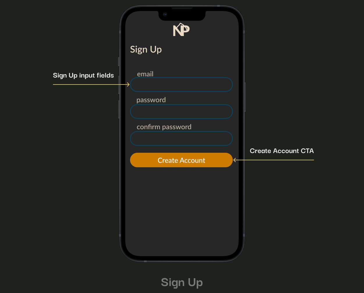
The Landing, Log In, and Sign Up screens were designed with a pretty straightforward and standard layout to provide familiarity and limit cognitive load for users.
The Profile page was designed to be hub for everything a user would need, from tracking progress to saving information or inspiration for later use. The Search/Browse page aimed to provide flexibility in how a given user can seek out resources. Whether that be searching for specific topics, browse for inspiration or even view any topic within a particular learning environment. The Search Results page was laid with vertical and horizontal scrolling to allow for a snapshot of each category but also giving the user freedom to choose a more in depth view of resource types.
The Browse results screen mimics the Search results screen in layout while provided more general results vs targeted search results. The Menu and Sort features were again designed to be familiar, limit cognitive load, and provide necessary options of navigation and search/browse results customization.
Usability Testing
The graph indicates how much time it took users to complete each task. All users completed each task in less than 3.5 minutes. Flow 1 was completed in an average of 118 seconds while Flow 2 was completed in an average of 130 seconds.
While the onboarding flow (Flow 1) was consistent with expectations and the results were satisfactory, the flow(s) navigating the other aspects of the platform left a little to be desired. While users indicated they felt the site was easy to navigate it did seem to take some time for them to learn how to utilize the features. This led to a number of the UI aspects being redesigned to lessen cognitive load and improve the overall UX.
User Flows
Style Guide
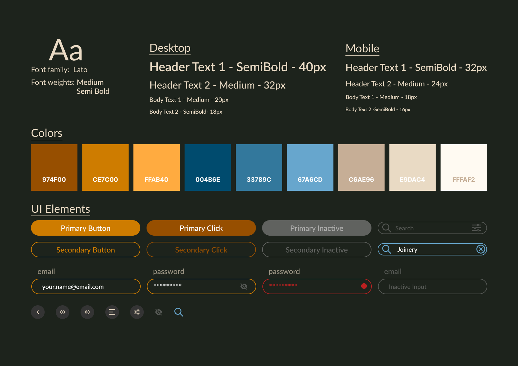
The Style Guide went through a number of iterations throughout the process as usability testing was completed and user feedback was compiled. We settled on a typography that was clean and legible, a color palette that invoked trust, energy, excitement, and calm as these are the feelings that users feel, or want to feel, when learning something new. The CTA buttons, input fields, and icons continued to evolve in a manner that allowed them to be more easily identified by the user for their intended purpose and allow users to more efficiently navigate the platform.
Hi-Fi Wireframes
After a lengthy iteration process that required a lot of work and provided a number of lessons learned, and a we arrived at hi-fidelity wireframes.
The Landing Page was updated to give the logo and slogan more room to breathe as well as lowering the CTA buttons to be more reachable touch targets. For the Log In and Sign Up pages the choice was made to remove Single Sign On options as the preference is to have users provide their email information directly to the platform rather than through a third party.
The layout of the Profile page underwent the most significant change, moving from cards to a list view. This change would provide a more clear path to consistency across multiple pages/features. The Browse and Search pages now include CTA colors along with a view of the Active and Inactive states of the search bar.
An addition Search Results screen was added to add depth to the search flow and a view of the “See All” feature. A Resource View screen was added to provide context of what users can expect to see when they want more details on a specific resource. The Sort menu was updated to include resource style preferences as well as more standard options.
Usability Testing
60% of users mentioned feelings of being overwhelmed by the search, browse results. Felt there was “too much going on”.
20% of users expressed that they accidentally touched “See All” when attempting to horizontally scroll results. A different 20% commented that they didn’t even initially see the “See All” link.
80% of users voiced feelings that the menu was lacking in usability. Mentioned having issues with being able to successfully select the desired options.
After the results were in from the second round of Usability Testing it was clear there was still significant work remaining. The challenges were troubleshooting how to provide information deemed necessary while adopting it to a format users found to provide a better experience.
Priority Revisions & Final Designs
The Landing/Log In pages went largely unchanged, the only update being the simplification of the logo to a monochromatic version.
While the Sign Up page went unchanged, the Profile page did undergo changes. Less of a focus was placed on the user’s profile picture with the user’s name and email address being added and the navigation to update/edit personal information given a more accessible touch target. These changes also created more consistency, aligning with the remainder of the lists design.
The most significant changes were made in how users view resource options. Search and browse results were simplified for vertical scrolling, eliminating the need for “See All“ navigation options. The results categories were moved to a horizontally scrollable, when applicable, menu located above the results.
The Search results screen sees the same treatment of the Browse results screens for continued consistency. The CTA button was added to the Resource View screen to provide users the ability to route directly to their chosen resource platform.
The Sort Menu underwent a much needed simplification as the updates to the Search and Browse screens eliminated the needed for the additions made during the Hi Fidelity wireframe stage. Both the menus were updated to align with the Profile page and create a desired consistentsy.
Thank you!
For my first end to end UX project this was a lot of fun, a lot of work, and a fantastic experience. There were challenges throughout as I began to understand where the process was going and how each step led to the next and how they all work together. I learned some hard lessons about giving each step the respect and care it needs and deserves. I am grateful to have gone through the process and to have learned all of the extremely valuable lessons it provided.


