Tracks & Packs
Tracks & Packs aims to shed light on the advantages of traveling by train and all of the possibilities it can connect adventure seekers with.
Work: From concept to research and research synthesis to sketching, wire framing, and ideation I worked closely with a Design Lab mentor to gain an increased level of comfort with the UX process and navigate the many challenges that arise throughout projects.
Problem: Planning vacations can be stressful. Planning a vacation with multiple stops can be incredibly stressful and require some, eventual, compromise. For outdoor enthusiasts this can be particularly difficult to navigate given the environmental impact of car and air travel.
Duration: 2 Months Role: UX/UI Design Student Tools: Figma, Pitch
Problem
NORTH AMERICA IS LARGE, TRAVEL REQUIRES ENERGY
Outdoor enthusiast are, by and large, environmental enthusiasts as well. North America is a large continent and travel requires a large amount of energy usage. Tracks & Packs aims to shed light on the advantages of traveling by train and all of the possibilities it can connect adventure seekers with.
One of the biggest environmental benefits of trains is that they consume far less energy than other types of transport. It takes a huge amount of fuel to get a plane carrying hundreds of people airborne, whereas trains are streamlined, require much less energy to move, and are increasingly able to run on electricity.
“Planes emit on average 4.84 times more greenhouse gas emissions than trains according to data from the European Environment Agency, which is a conservative low estimate.”
- Greenpeace UK
Solution
SHINE A LIGHT ON TRAIN TRAVEL
Train travel is a largely overlooked travel option in North America. Half of the goal is to highlight all of the advantages train travel provides. Including environmental impact and low stress boarding/accommodations.
CONNECT THE DOTS
Outdoor enthusiasts want to be…well…outdoors. Our goal is to connect travelers who enjoy nature with all of the sites, activities, and adventures that can be accessed by train.
“In fiscal year 2022, Amtrak served 22.9 million passengers. That figure was down ten million from 2019 when 33 million people rode Amtrak, a 30% decline. By contrast, in 2022, some 736 million U.S. air passengers were screened by the TSA, as airline travel returned to near pre-pandemic levels.”
- Michael Goldstein of Forbes
These numbers indicate a significant opportunity for growth within the rail industry to identify a type of traveler that is looking for an alternative to the high stress, high pollution, high cost modes of transpor-tation currently ruling the travel industry.
We want to know why users don’t opt to travel by train for adventures so that we highlight the advantages and help connect them with the sights/activities available along railways.
Research
Objectives
Goal
Determine what are users’ top priorities for travel.
Understand how travelers currently plan trips/activities.
Understand why train travel has or has not been a viable option for previous trips/adventures.
Learn what would make train travel a more appealing mode of travel for users.
Objectives
Why do/don’t users consider train travel?
What are the perceived positives, negatives users have regarding train travel?
How often do users travel within North America, what time of year?
Why isn’t train travel considered more often for travelers, adventure seekers?
What challenges do users face when planning trips within North America?
Key Takeaways
Interviewees rarely consider the train
The limits of the train system could have significant impact
Perception of the limits of the train system is a major hurdle
There is very low awareness of how the train system operates/what it has to offer
Interviewees prefer to handle vacation planning across as few platforms as possible
The interviews conducted resulted in some interesting challenges. Notably, how little the interviewees even consider the train when planning vacations as well as the real and/or perceived limitations of the train system in North America. The challenges will lie in how to highlight everything the train does offer, attempt to expand on how the train is currently utilized, and how to raise awareness of these aspects to users that do not typically consider train travel when planning vacations.
To try examine the root of theses issues and come up with genuinely useful solutions, How Might We questions were used as a tool to synthesize this data and inform the design decisions to come.
How might we encourage travelers to consider train travel as a viable option when planning vacations?
How might we better showcase the full range of destinations, services, and features available within the train system?
How might we position train travel as a key part of destination-specific vacation experiences?
How might we raise awareness about the convenience, environmental benefits, and unique experiences that train travel can offer vacationers?
Task Flow
Task flows were created to help understand how users complete the tasks related to the features being created by providing clear, step-by-step guidance, increasing efficiency and reducing errors. The goal is also to enhance consistency across interactions and help identify areas for improvement.
Sketches & Wireframes
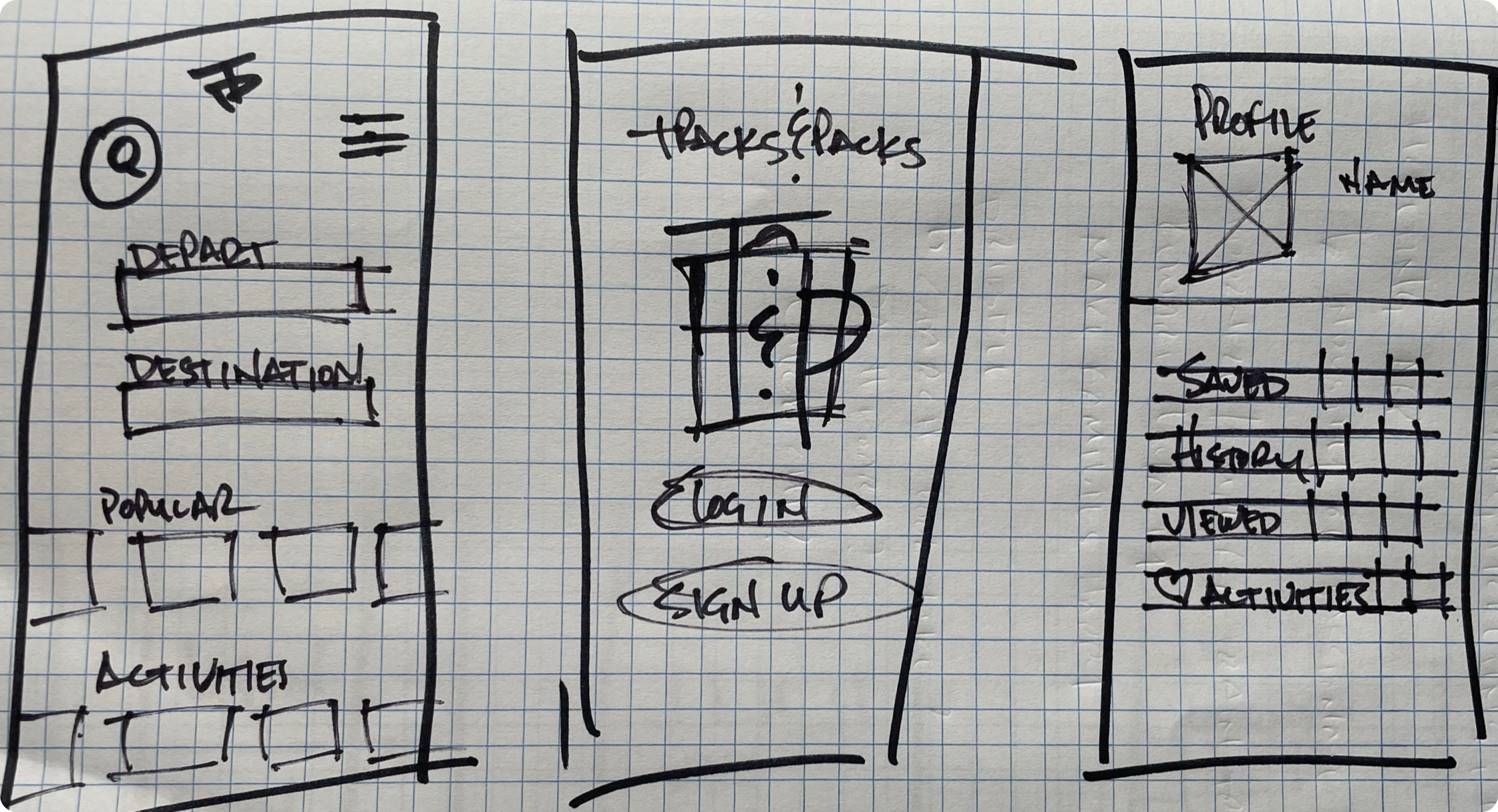
From the onset of sketching and into wire framing, the goal was to create an incredibly simple, while still visually interesting, format creating an intuitive and easy to navigate experience for users. We envisioned minimal icons, minimal items to click, minimal information inputs, and full screen images to highlight the experiences to come.
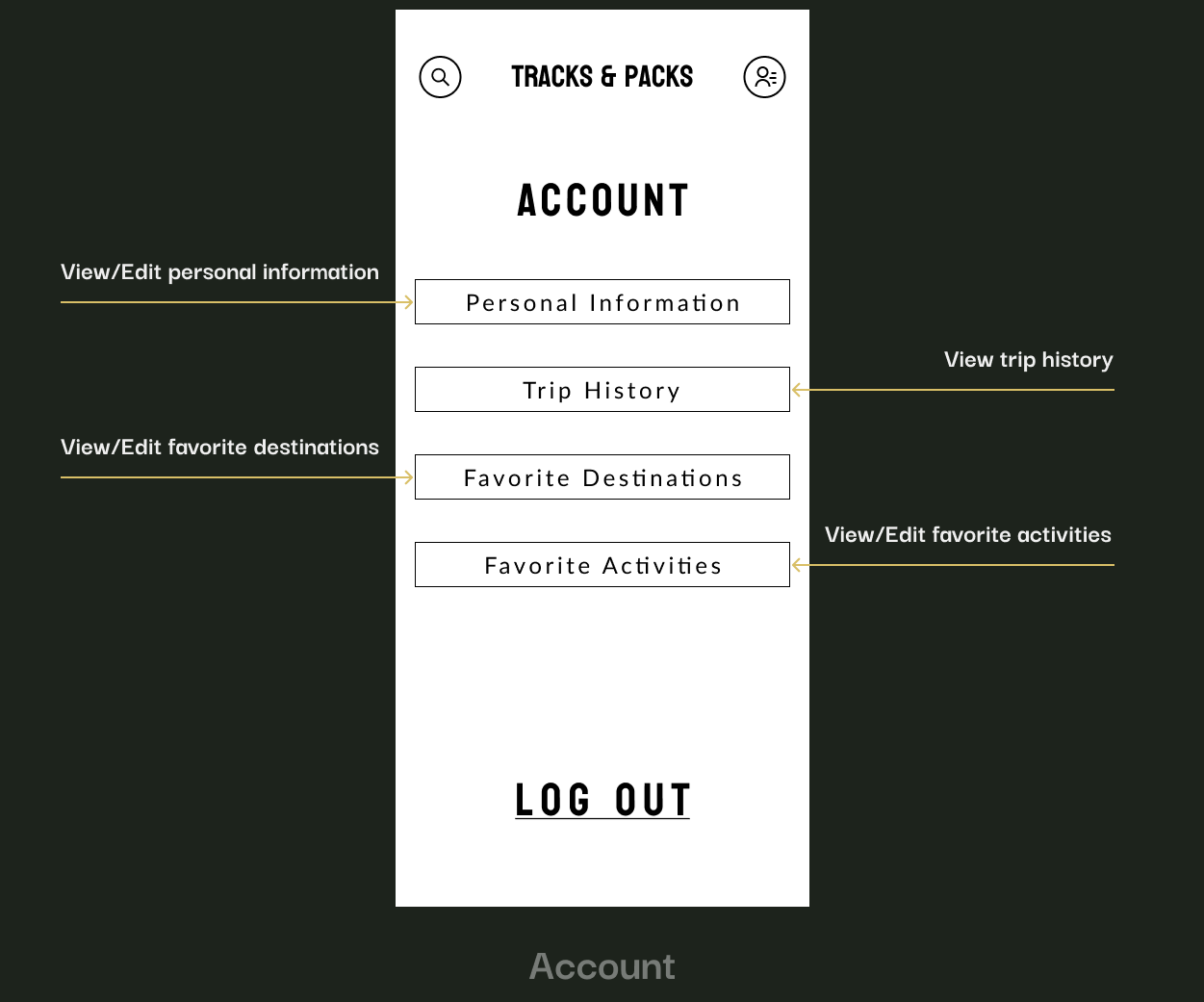
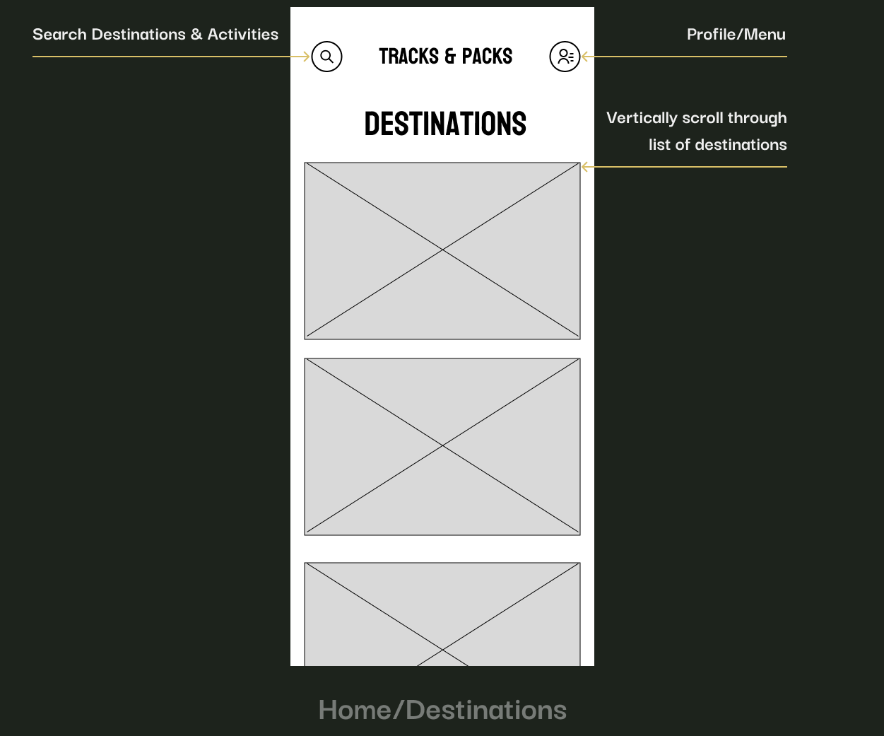
The Home page was laid out with the idea that users can either search Destinations they would like to visit and explore what type of activities can be found in and around the area or search the type of Activities they prefer and see where they can travel to that has those available. The Profile page allows users to add/store personal information, travel history, and destination/activity preferences.
The Destination View Screen provides a synopsis of the location as well as a list of popular activities around the area. The Booking Calendar and Trip Summary screens outline the layout for the booking user flow.
Style Guide
The simplistic nature of the overall designs lead to a lean approach to the style guide. The sole pop of color chosen to be utilized is the rust color in the logo and CTA buttons. This color was chosen due to the connection with, not only, train tracks but also the dirt, gravel, and stone involved in so many of the outdoor activities we love.
HiFidelity Wireframes
The Home screen saw some minor changes with Destinations/Activities being updated from separated screens to tabs on the same screen while the Destination/Activities buttons were reduced in size for higher visibility and less scrolling. A view of the Menu was added and the Account page saw a switch from buttons to a list view.
The Destination View and Booking Calendar screens saw a layer of detail and design added while a Seat Selection screen was added to further develop the Booking user flow.
Usability Testing
While users expressed an overall positive experience, they did voice some concerns. Multiple users indicated the presence of the "Book Now" CTA button across multiple screens was confusing. Multiple users also expressed confusion surrounding the required information necessary to book, the number of steps in the process, and where they were in the process.
Given the overall simplicity of the platform, the initial sketching and wire-framing were pretty bare bones to the point where it did not seem viable to conduct Usability Testing at that point in the process. I felt that adding more detail and screens would be much more beneficial to the experience and process before conducting testing. As such, this project did ultimately only contain one round of usability testing. In the end, testing did provide excellent feedback on what, in retrospect, were some pretty glaring issues in the initial designs.
Priority Revisions & Final Designs
The Home and Account pages were left unchanged and the only change to the Menu was to move away from using the CTA color for the border stroke to limit any potential overuse.
The following screens are where the most significant changes occurred resulting from usability testing feedback and utilizing the design foundation to provide a more complete view of the booking flow. The Book Now button is now limited to the Destination View screen. A progress tracking bar was added to the booking process to provide users a clear view of where they are in the process.
As we continued to develop a complete flow, screens were added for selecting the number of travelers and selecting specific seats - with a link to explore private cabin accommodations - as well as adding a summary of the booking for increased visibility. The CTA button was updated to reflect the natural end of the process with the user being prompted to Proceed To Checkout.
Responsive Designs
Thank You!
This was an extremely rewarding project given my personal affinity for the outdoors and my desire to work toward a situation where rail travel is comparable to our friends in europe and japan. Maybe through highlighting what we do have to offer and what adventures our current rail system can lead us to will help produce some momentum toward making significant change. It was challenging collecting research data due to how little the rail system is considered in my area of the country, but I thoroughly enjoyed the entire process.


