Needle & Groove
An app designed to elevate the vinyl collection, vinyl purchasing, and music discovery experience.
Needle & Groove aims to be a platform that provides users easy, efficient ways to catalog their collection. While we strive to provide the most efficient way to accurately log a collection, we also look to incorporate features that would be similar to what makes streaming music so convenient - A shuffle-like feature that will suggest albums from a users collection at random for the user to pull and play, as well as suggesting new artists/albums for users to explore. On top of the previously mentioned features, Needle & Groove will act as a peer-to-peer eCommerce application allowing users to buy and sell records.
Duration: 2 months Role: UX/UI Design student Tools: Figma, Pitch
Summary: Creating a clean, simple UI coupled with reliable features - collection management, new artist discovery, streaming integration, eCommerce - opens the door to providing the high priority features users are looking for all in one place.
Work: I continued to work closely with a DesignLab mentor while applying everything that I have learned over the my duration in the program and my previous projects. The goal was to improve upon areas that provided challenges while polishing processes that I had more comfort with. From competitor analysis, to user interviews/research, sketching, wire framing, and usability testing the focus was to continue building my skillsets to provide a visually pleasing interface with high levels of usability while combining as many of the features users express as high priority.
“What I love about vinyl is the artwork. Great photography and graphic design and great imagination. Vinyl is like the poor man's art collection.”
— Noel Gallagher of Oasis
Problem
While an ever increasing number of people are drawn to the warm sound of vinyl, album art, and a return to owning physical media…the more collections grow, the more issues can arise. Namely, the ability to catalog one’s collection in a manner that lends itself to easily and efficiently being able to maintain, organize, and search that collection. Other issues also are exposed in the ability to adequately rotate through the collection - and not get stuck in ruts of listening to the same albums over and over again - or being exposed to new artists/albums which streaming services have made a cornerstone of music consumption.
The cornerstone of modern record collections is knowing what you have and finding what you don’t. While there are a handful of platforms aimed at providing these features, the market seems poised for one that provides more.
Having to juggle multiple apps for streaming, cataloging physical collections, buying/selling albums, and discovering new music can be a daunting and cumbersome task. Users are looking for an option that limits the need for this.
"Revenues from vinyl records grew 17% to $1.2 billion – the sixteenth consecutive year of growth – and accounted for 71% of physical format revenues. For the first time since 1987, vinyl albums outsold CDs in units (41 million vs 33 million)."
— Keith Caulfield, Billboard.com
As vinyl sales continue to grow, the need for a high quality, highly usable platform to facilitate the priorities of users only increases.
Research
Competitor Analysis
Conducting competitor analysis was essential in identifying what available platforms offer, what they may be missing, and where we could find a way to provide an experience users were not receiving elsewhere. The information gathered at this stage would be paramount in informing decision surrounding feature sets.
Goal
We want to know the pain points users currently experience using similar platforms, what features they feel are, or aren’t useful, as well as what users may feel like is missing from current platforms.
User Interviews
Objectives
-Determine most prevalent pain points users experience with currently available platforms.
-Understand what issues users currently have with managing their record collections.
-Learn what users find most and least useful with currently available platforms.
-Understand what users feel will be most useful for cataloging their record collection as well as what they feel like is missing from current platforms.
Personas
Questions
-What methods do users currently use to catalog their record collection, buy and sell records, stream music from, and learn about new artists?
-What are the biggest pain points with the current methods being used?
-What features do users feel are, or would be, most useful?
-What are some issues or pain points users have when buying/selling records?
Upon completing the user interviews Personas were developed to create a more firm understanding of the target users as well as attempting to ensure a reliance on user driven data vs designing based on personal assumptions.
Key Takeaways
Interviews provided incredibly valuable insight. It became very clear how many current platforms offer some, but not all, features users desire. While there are users that are quite happy with sites like Discogs, they acknowledge existing shortcomings. Interviewees confirmed many assumptions heading into the process but also made it clear my ideas about the scope of the feature set users desire was going to require considerable reworking, thought, and planning.
Upon completing the user interviews the next step was to hone in on understanding all of the information collected. For this, asking How Might We questions were chosen to really work through addressing as many of the concerns identified by users.
How might we reduce friction in the discovery-to-listening process for users exploring new artists within the app?
How might we design a cohesive platform where users can discover new music, manage collections, and engage with other music lovers without feeling the need to use multiple platforms?
How might we make the platform approachable and engaging for casual users while still providing robust tools for serious collectors?
How might we provide a detailed and rich product catalog that is easy to set up, with minimal effort from users while offering extensive information?
Feature Roadmap
Before moving on to any design work it was important to understand, zero in on, and prioritize the features needed to achieve the goal of solving the problems identified in user interviews and ultimately launching a successful application.
Sitemap
With the Feature Roadmap established attention turned to laying out the sitemap to continue forming a guide in which the platform would build its feature set within.
Sketches & Wireframes
Upon learning what users deemed priorities the challenge was to plot out a flow that combined all of those and more. Before sketching even began, I scoured a large number of competitor, streaming, and eCommerce platforms as well as any adjacent platforms that may have similar features/feature sets I could gain insight and inspiration from.
After a series of sketch iterations, the design outline started coming together. While exploring some more creatively complex paths to see what those ideas could spark, distilling them down to their most simple and usable versions was the focus.
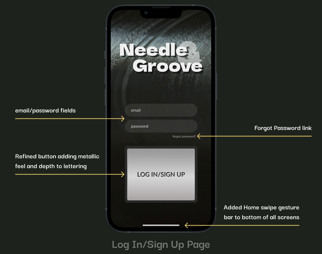
The Log In/Sign up page was kept as simple as possible with the CTA button mimicking the Start/Stop button found on many modern record players. Upon logging in, users are routed to the site Store where they can discover, track, preview, and purchase albums.
The Album page and Seller profile page were designed to provide as much information as possible to allow the purchasing user to make an informed decision for each potential purchase. Features on the Album page - “Similar Albums” & “More From This Artist” - provide additional avenues for users to discover new material.
The challenge with the collection page was displaying what information/categories users would most need more immediately while still allowing easy access to the remaining features. The focus was on combining functionality with a level of user customization. Adding Albums was designed to accept multiple methods to ensure users are able to control their preferred method.
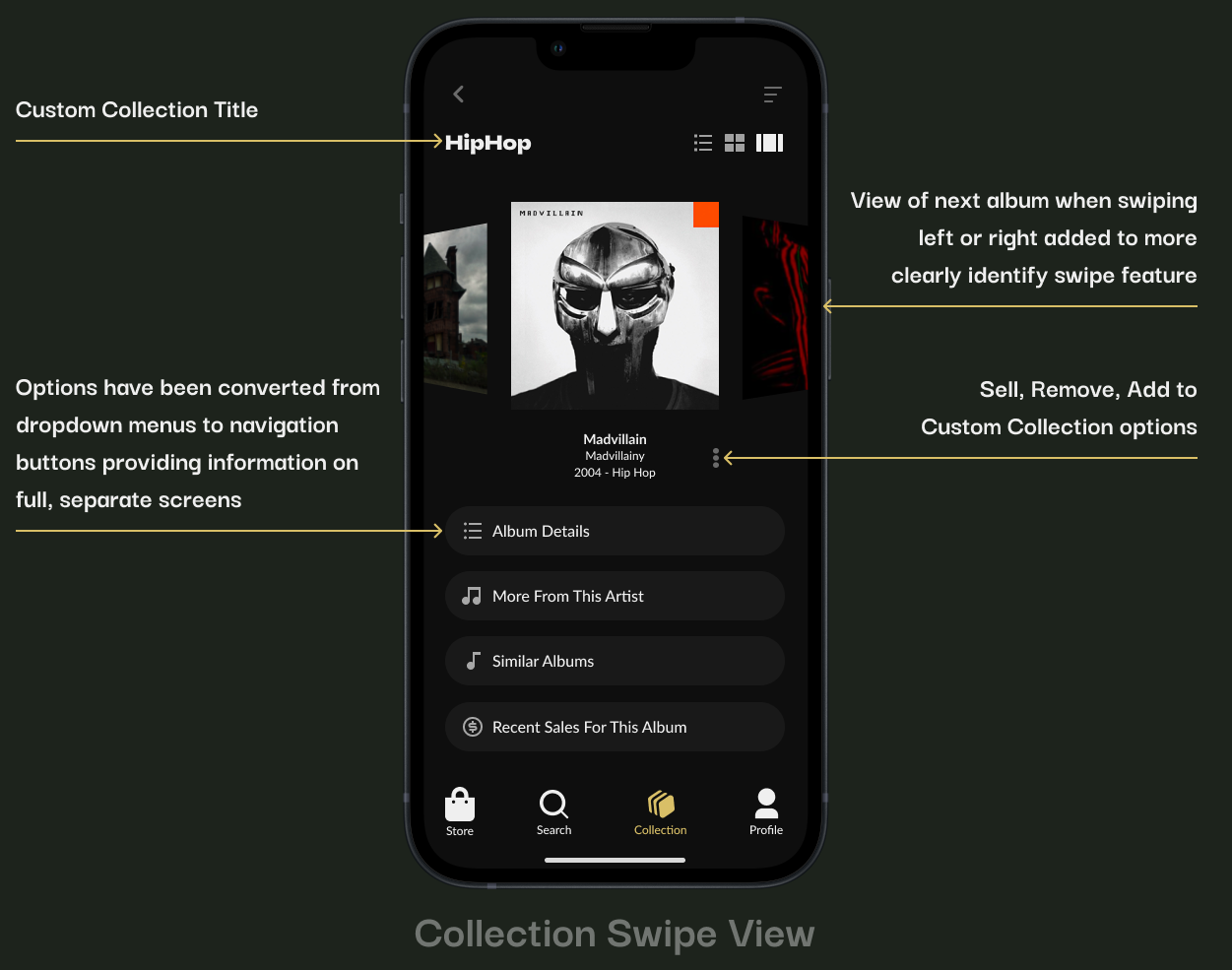
Collections were built with the understanding that users have varying preferences around how they prefer to view and search their lists. The Swipe view provides the Album View layout with the largest view of the album art and easiest access to additional album information. Users can swipe left and/or right to move to the next album(s) in their collection. Each album also provides the options to remove the album from their collection to mark as “For Sale”
The list view operates with vertical scrolling and smaller thumbnail images of the album art. Users can select a given album to access the features in the album/swipe views. All lists have access to select sorting preferences.
The Grid View was designed for those who prefer larger images of album art but more than a single album on screen at one time. While the Cart is pretty straightforward, the ability to see the total price and having an easily accessible way to remove each item added to the cart.
Checkout was designed with mental load and familiarity at the forefront while ensuring to include features like Express Checkout and the manually entering shipping info (for shipping to an alternate address).
Usability Testing
While usability testing brought largely positive results and feedback, there were some common questions and concerns that shined light on needed improvements.
Style Guide
Green and Gold were selected as the lone uses of color throughout the design. These colors were chosen as they represent growth and luxury. The use of color is intentionally minimal as the goal was to allow the album art to shine.
HiFi Wireframes
With Usability Testing complete, feedback and data synthesized the focus was on resolving the issues identified, refining designs that reflected necessary changes, and solidifying the overall style of the platform.
Email and Password fields were added to the landing page to simplify the Log In/Sign Up process and avoid adding a separate screen for this information. The CTA button was refined to more realistically achieve the look of a physical record player button. With the style guide in place, color was added to the platform to make items like where the user is and what items have been added to the Wish List more visible. The Community feature was removed and added to a list of features to be added later.
The ability to tune recommendations was added to allow for a more personalized experience and address user testing questions. The Collections icon was rotated to more closely mimic the look of a stack of records. With the CTA color identified it was added to appropriate buttons which have also had the corner rounded for a cleaner look.
The Album Preview screen was added to display what the user will experience when choosing to preview an album with their linked streaming account. The Seller Profile page went largely unchanged at this point, continuing to display access to the seller’s history, rating, and collection infomation.
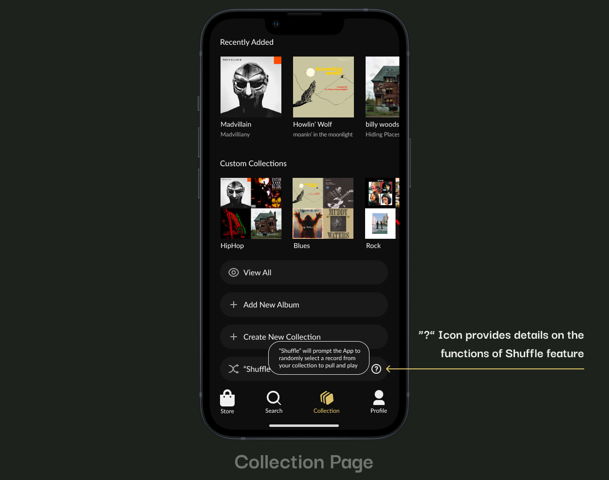
The biggest change to the Collection Page was adding the “?” icon to provide explanation of how the Shuffle feature functions and address questions uncovered during usability testing.
The Add Album screen was updated with the image of a record barcode to illustrate the function of the camera view finder. The Swipe View page was updated to show albums to the left and right of the current album to provide context of the swipe view feature and make the screen discernible from the Album View screen.
The corners of the Remove/Sell popup were rounded to provide consistency with the now rounded CTA buttons. The Recent Sales screen shows an expanded view of the recent sales tab to display the information users will see and be able to access.
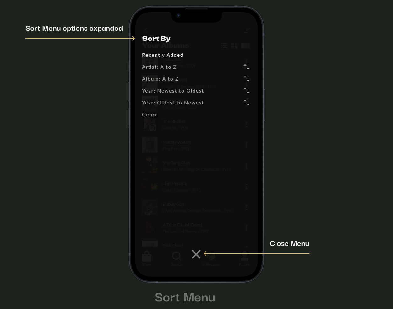
The Collection View page went unchanged aside from adding actual album art and info for a realistic view of the experience. The Sort Menu was updated to include a “Recently Added” option after users expressed questions surrounding the ability to return to this view once another was chosen.
Album art and information were, again, added to the Collection Grid View page to provide a more realistic view of what users will experience. A common question discussed in usability testing was about shipping and whether all shipping was free, shipping options were added to the Cart page to provide users with options to upgrade their shipping preferences.
With the checkout page utilizing a pretty standard layout, changes were minimal with the only update involving the rounding of the CTA button to align with changes made to CTA buttons across the platform.
Usability Testing
With Hi Fidelity wire frames in place, it was time for another round of Usability Testing to ensure the updates effectively addressed previous issues and to identify any new or remaining user concerns/questions.
-
40% of users wanted more customization options for categorizing their collections, such as tags or personal notes when adding new albums to their collection.
-
25% of users mentioned that the way product descriptions were displayed was too lengthy, and key information was hard to find.
-
60% of users had questions about how they could send album information to friends/family, whether a site member or not.
Another round of Usability Testing and another round of challenges and opportunities to make improvements. Attention was now turned to thoroughly scrutinizing each screen and element to identify how we might address user issues/concerns and continue to push the designs to provide the most consistent and usable experience possible.
Priority Revisions & Final Designs
Armed with additional data the challenge was to both zoom in and out to determine the best path to designing a product users would truly enjoy. First, the zoom in to identify specific elements users discussed in all of the research obtained. Then the zoom out, to identify how these would fit and if the changes created new opportunities to better achieve the results and overall consistency.
The swipe gesture was added to all screens to allow users to exit the application from any point within the platform. The unselected heart icon was removed to declutter the album art images. The option was added to one of the number of screens converted to full screen overlays meant to increase visual interest, accessibility, and an increase in user options.
The Tune Recommendations screen is the first of a handful of screens converted to full screen overlays adding a higher level of consistency while adding options such as the ability to share an album via texting or emailing a link to friends or family. Dropdown menus were converted to buttons navigation to separate, full screens improving how information is displayed.
Clicking on the minimized media player will expand the feature to a full screen view providing a larger view of the album art, larger track controls, while still allowing for a vertically scrollable track list.
Upon pressing play using the full media player the vinyl, specific to the version uploaded by the user, will become exposed via animation. Conversely, the vinyl will “slide” back into the sleeve when pause is selected. The Seller Page again reflects the shift from dropdowns to buttons navigating to separate, full screen displays.
The Cart and Checkout screens were left unchanged as they felt complete from layout, design, and information standpoints.
Again, the Checkout page was left unchanged while the Collection Page continued the conversion from dropdowns to buttons.
Although there was some consideration to convert the “Shuffle” explanation from a popup to a full screen layover, it seemed to be a little overkill for the amount of information provided. As such, the Collection Page and Collection List View pages were left as is.
With the Collection Grid View feeling solid, attention was turned to converting the Sort Menu to a full screen overlay to ensure high levels of consistency across screens and within the application as a whole.
The Collection Swipe View continued the conversion from dropdowns to buttons. The Recent Sales page illustrates the positive impact of those changes, showing the the ability they provide to show more information, improved ability to visually display additional information vs simply via text.
Once again the full scree overlay change provides consistency and accessibility by increasing visibility, touch targets, and options available to users (i.e. adding “Add To Custom Collection” option to the Remove/Sell screen). The initial Add Album screen was left unchanged as the design and functionality goals felt like they were met.
Two additional screens in the Add Album flow were added to provide a more complete view of the process. The first of which is the screen the user will be routed to once an album is scanned. This screen will show a version of the Album View screen providing users the ability to explore pertinent information - such as album details and album details - along with options to add the album to the Wish List or Share the album with someone else. The next is when the user chooses to fully add the album to their collection, where they can choose to add to one or more Collections.
Thank you!
Vinyl albums are a place where music and visual arts collide. Given my direct affinity for both of these mediums this project was incredibly exciting, challenging, and rewarding. I really wanted to create a platform that allowed the album art to shine with an easy functionality all while packing in as many of the priority features as possible. The sketching and wire framing iteration process was instrumental in striking the necessary balance of usability and feature set/layout. From narrowing down options for features on the navigation bar to ideating on how to display the needed information in a way the didn't short change details or lead to a cluttered, overwhelming UI there were no shortage of challenges. But knowing the solutions were out there and working through a number of ideas made working toward and reching this final product all the more satisfying.


